Quick Overview:
A WordPress theme is a pre-built site layout that you can edit according to the requirements. Adding your content, integrating relevant plugins, and hosting it requires minimal effort. However, sometimes, such themes don’t provide overall control to you. Due to this, your website starts lacking, and it needs to align with the business goal and message.
However, with a custom WordPress theme development, you can curate an appealing theme for your business solution. It would allow modification of any function, plugin, component, website looks, navigation, and more. But, to develop a top-notch theme, the correct procedure is required, which you will know here. So, let’s get started.
Why Should You Consider Custom WordPress Theme Development?
When you open the WordPress website development portal, you will find numerous pre-build theme templates. You can select any of them, add content, integrate a plugin, and launch your site or business online.
However, such theme templates sometimes restrict changing a component’s location, background, widgets, and all other features. Due to it, you must find another available theme or settle for it. And both methods are not viable for your business. One can waste your time and efforts in finding and configuring the theme, and the other can downgrade the business metrics.
However, there’s a reliable mechanism through which you can get a theme per your requirements. And that method is Custom WordPress Theme Development. If you are facing the mentioned problems, you must avail of WordPress Theme Development Services.
In addition, with custom theme development, you can create a responsive design containing all the necessary plugins. And with the functionality designed according to the comfort of your end-users.
Recommended Read: WordPress.com vs WordPress.org: Which One is better?
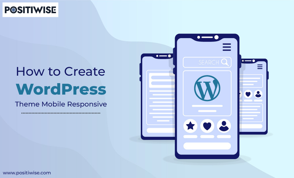
The Need Of WordPress Mobile Optimization
While developing a custom theme, many developers need to optimize it for mobile devices, such as smartphones and tablets. As only some users access the website on a desktop, developing a mobile responsive WordPress theme is essential. It aids in various factors, such as:
- It supports reaching out to every user, irrespective of the device.
- It helps to increase user traffic retention and conversion rate, as most people use mobile phones to access the sites.
- The quality of the website is retained on every device.
- The ranking of websites increases as Google prefers mobile-friendly websites as compared to sites native to desktops.
- It helps to save time, cost, and effort, as you only need to invest in one WordPress website that can run across all types of devices.
A Descriptive Answer To “How To Make WordPress Site Responsive”?
Download and install WordPress on the local machine to start with the WordPress theme development. It will help you efficiently build, store, and configure the mobile responsive theme. In the further steps, HTML and CSS will be used. So, you must learn their fundamentals to understand the procedure reliably.
Step 1: Generating and Save the Template Files
According to the WordPress documentation, the theme files contain two primary directories, known as index.php and style.css. And under the mentioned directories, further associated files get stored, which include:
- header.php
- footer.php
- functions.php
- sidebar.php
- single.php
- page.php
You have to create and store all these files on the WordPress platform to utilize your theme and use it for creating a responsive website. All the mentioned files will contain the code for different page sections. For instance, the header.php file will have the HTML code for the top section of the page. Footer.php will store the code for the bottom of the webpage. Similarly, functions.php will cover color combinations, scripts, menu designs, and complete functionality code.
Further, sidebar.php, single.php, and page.php will aid in creating the sidebar components and display a specific post of a particular webpage and overall page content simultaneously.
All the mentioned files are necessary for WordPress theme development, and you must create them all. However, when you do custom theme development, WordPress allows you to edit all the files as per requirements.
Now comes the practical part of saving the file at an appropriate location. You must access the WordPress administrative panel (cPanel or hPanel) to do so. Once it gets opened, navigate to the wp-content, then to themes, and create a new folder under it. Further, create and save all the mentioned PHP template files under it.
Step 2: Configuration of associated CSS Stylesheet (style.css file)
An appealing and adaptive design is an essential component of a responsive website. And to achieve such an objective, CSS Stylesheet will help you. In this CSS file (style.css), you must define the color contrast, fonts, and other webpage elements.
But, before you start writing the CSS code, WordPress requires the developers to add some crucial details in the form of comments at the top. You must add the theme name, author name, author URI, theme description, version number, license, and license URI. While defining the details, use only WordPress-defined keywords. For better clarification, you can reference the below snippet.
/*
Theme Name: My Theme
Author: Hostinger
Author URI: http://www.hostinger.com/tutorials
Description: My first responsive HTML5 theme
Version: 1.0
License: GNU General Public License v3 or later
License URI: http://www.gnu.org/licenses/gpl-3.0.html
*/
Furthermore, after adding the CSS stylesheet, WordPress will show the custom theme with its name. But, at this stage, you will only see a blank website/webpage, as the index.php is still empty.
Now, you must verify that the CSS file is getting detected. To do so, open the file and add a basic CSS code, such as counting the background image of color to the webpage. However, remember to leave a line after the theme information you mentioned in the comments.
Besides, you can return to the style.css file anytime to add and update visual designs to each component. As a result, your WordPress website will get optimized across all devices and platforms.
Step 3: Enabling Functionality of WordPress Mobile-Friendly Theme
After defining the design and visual appearance of the WordPress theme, it’s time to configure its functionality. It will support making the theme adaptable to different device screen sizes, assuring all end-users a seamless experience.
For instance, if your user accesses the site on a mobile device, the theme components will be displayed at their respective place. The color contrast, fonts, and image quality will be retained.
Further, we will use the functions.php and sidebar.php template files to add functionality to the theme.
Inside the functions.php file, your primary aim would be normalizing the CSS components. It will help you display the website as it is across all devices, including desktops, mobile phones, tablets, and more. To do so, add a file with the name normalize.css under the functions.php and define a function to access the normalize.css file whenever the site gets access.
<?php
// This function enqueues the Normalize.css for use. The first parameter is a name for the stylesheet, the second is the URL. Here we
// use an online version of the css file.
function add_normalize_CSS() {
   wp_enqueue_style( 'normalize-styles', "https://cdnjs.cloudflare.com/ajax/libs/normalize/7.0.0/normalize.min.css");
}
add_action('wp_enqueue_scripts', 'add_normalize_CSS');
Following it, add the sidebar widgets code in the same file. Then, define the custom navigation to it and enable the Menu feature under the Appearance.
// Register a new sidebar simply named 'sidebar'
function add_widget_support() {
               register_sidebar( array(
                               'name'          => 'Sidebar',
                               'id'            => 'sidebar',
                               'before_widget' => '<div>',
                               'after_widget'  => '</div>',
                               'before_title'  => '<h2>',
                               'after_title'   => '</h2>',
               ) );
}
// Hook the widget initiation and run our function
add_action( 'widgets_init', 'add_widget_support' );
// Register a new navigation menu
function add_Main_Nav() {
register_nav_menu('header-menu',__( 'Header Menu' ));
}
// Hook to the init action hook, run our navigation menu function
add_action( 'init', 'add_Main_Nav' );Furthermore, you must add the code in the sidebar.php file to allow the widgets to display in the browsers.
<?php if ( is_active_sidebar( 'sidebar' ) ) : ?>
  <aside id="primary-sidebar" class="primary-sidebar widget-area" role="complementary">
    <?php dynamic_sidebar( 'sidebar' ); ?>
  </aside>
<?php endif; ?>
Step 4: Develop the Custom Theme Layout
Now, it’s time to customize the overall layout of the webpage by adding the code to all the files mentioned in Step 1. You will edit the header.php, single.php, page.php, index.php, and footer.php files here.
Firstly, in the header.php file, define the document type, similar to any HTML code. Then, determine the header elements, add metadata, and link tags. In addition, use the wp_head() hook, body_class function, and wp_nav_menu() within the code.
Further, edit the index.php file. It will be used as the homepage, so utilize the correct tags. Ensure to add the header, footer, and sidebar tags along with <section>, <article>, <header>, and <main> tags.
Following it comes the footer.php file, defining the bottom of the WordPress website. For this, you can use the semantic HTML5 element <footer></footer>. In addition, now configure the single.php file using the the_content() function. It will help you display a particular post on the screen.
Lastly, add the code to the page.php file to configure the display of responsive web pages across different screens and devices. Moreover, add the sidebar code again to this file to allow content to get displayed across 70% of the page.
Step 5: Enhancing the CSS Stylesheet Design
Lastly, after adding the code to each template file, customize the style.css file accordingly. In this file, you can add boundaries, background images, effects, and more for each component. Now, your theme is ready to use.
Furthermore, now you know which template or style needs to be accessed if you want to change any of the components.
Get a Custom WordPress Site Built by the Best WordPress Developers
Our expert WordPress developers are ready to build your custom WordPress site. 10+ years’ experience. Satisfaction guaranteed. Free consultation!

Wrapping Up
For developing mobile responsive WordPress themes, it’s essential to understand the requirements and then move further with the process. The procedure includes five steps: PHP template files are created using the cPanel or hPanel. Then, you have to add and link the code to each. Further, the CSS file gets configured for each of the components. And as a result, you get a mobile-friendly WordPress theme.
Further, due to such a responsive theme, your website opens on every screen and showcases all the content in the utmost quality. Also, the search engine ranks it in the top list. However, you must avail yourself of custom WordPress theme development services from an authentic company, such as Positiwise Software Pvt Ltd.

Expert in Marketing Strategy and Brand Recognition
Jemin Desai is Chief Marketing Officer at Positiwise Software Pvt Ltd, he is responsible for creating and accelerating the company’s marketing strategy and brand recognition across the globe. He has more than 20 years of experience in senior marketing roles at the Inc. 5000 Fastest-Growing Private Companies.